Key'Link Corp
Bridging vision and reality through strategic branding and corporate identity design.
Key’link Corp is a strategic business services firm built on the belief that success does not happen by chance. It is the result of informed decisions, efficient systems, and expert guidance. Designed to support startups, SMEs, and growing enterprises, Key’link exists to bridge the gap between entrepreneurial vision and structured execution through corporate services, compliance, operational support, and business acceleration.
The Challenge
The challenge was to design a corporate identity that avoids generic visual language often associated with consulting firms.
The brand needed to:
- Communicate authority and trust
- Feel modern and forward-thinking
- Maintain simplicity and clarity
- Stand out in a highly competitive corporate space
1. Brand Identity Development
Logo Design & Visual Assets:
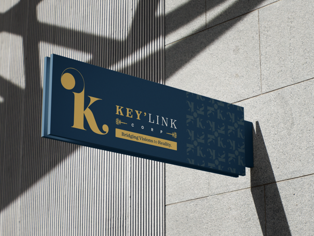
The identity was built around the symbolism of the “key” and the “link,” reinforcing the brand’s role as the connector between vision and value. The logo system combines elegance, clarity, and authority, creating a professional corporate presence that feels both established and forward-looking. Supporting visual assets were designed to reflect structure, access, partnership, and premium service.
Accents of Emerald Green and Natural Sand represent healing, vitality, and balance.
Color Palette:
A composed and strategic palette was developed to communicate trust, professionalism, and growth:
- Executive Navy
- Golden Insight
- Strategic Sand
- Ivory Canvas
- Clarity Charcoal
- Trust Blue
- Growth Teal
- Bold Magenta
2. Brand Positioning & Voice
Corporate Touchpoints:
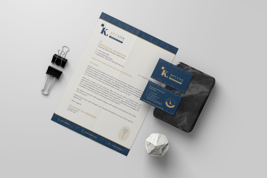
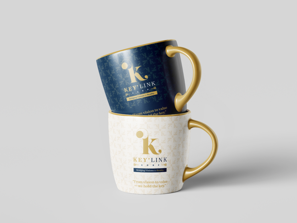
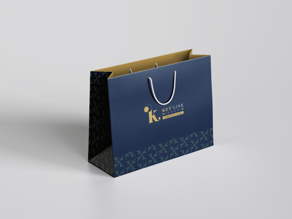
The visual identity was extended across essential business touchpoints including stationery, presentation materials, office branding, and branded collateral. Every application was designed to maintain consistency, clarity, and executive presence, ensuring that the brand feels credible and polished at every interaction. The system supports both internal professionalism and external trust-building.
Professional Brand Experience:
Applications such as letterheads, business cards, signage, and brand mockups reinforced Key’link Corp as a structured and dependable partner. The goal was not only visual consistency, but also to create a corporate experience that reflects operational excellence and strategic support.
3. Content & Communication
Tone of Voice:
Key’link Corp’s verbal identity was developed to feel clear, strategic, confident, and supportive. The language avoids unnecessary complexity and instead focuses on communicating competence, partnership, and business clarity. It positions the brand as more than a service provider; it presents Key’link as a trusted enabler of growth.
Tagline & Messaging Examples:
“Bridging visions to reality.”
“From vision to value — we hold the key.”
These lines reinforce the brand promise: helping clients move from ideas and ambition into structured, scalable success.
The Solution
A strategic and visually disciplined brand system was developed to position Key’link Corp as a premium corporate services partner. By combining strong symbolic identity, a refined palette, structured typography, and confident messaging, the solution created a brand that feels professional, modern, and dependable across every touchpoint. It transformed Key’link from a functional service provider into a brand with authority, clarity, and long-term value.
The Impact
Key’link Corp’s identity now communicates the qualities its audience looks for most: trust, professionalism, structure, and strategic guidance. The branding strengthens the company’s positioning in the market, builds confidence across client touchpoints, and supports its role as a bridge between ambition and achievement. Rather than appearing transactional, the brand now feels like a reliable long-term partner for businesses ready to grow.
Final Thoughts
Key’link Corp is a brand built on clarity, confidence, and purposeful structure. Its identity reflects more than corporate services; it reflects the promise of turning complexity into opportunity. Through a refined visual language and a strategic foundation, the brand positions itself as the key link between vision and sustainable business success.